Lettering in engineering drawing is the art of writing essential text on technical drawings. It ensures clear communication of details, specifications, and measurements. Why is it so important? Because without proper lettering, even the most precise drawing can become confusing. In this article, we’ll explore its significance, types, and techniques, and share practical tips for effective lettering in engineering drawings.
What is lettering in engineering drawing?
Lettering in engineering drawing refers to the method of writing text, such as dimensions, notes, and titles, on technical sketches. It must be legible and standardized to convey accurate information. Whether it’s about material specifications or assembly instructions, lettering acts as a language for engineers and manufacturers.
Lettering is one type of freehand drawing. A perfectly legible freehand lettering is an essential part of engineering drawing. All the information on the drawing is always mentioned through lettering.
The Bureau of Indian Standards (BIS) recommends Latin alphabets and numerals for engineering drawing in IS 9609 (Part I): 2006
The Anatomy of Good Lettering
To truly appreciate the importance of lettering, let’s break down its key components:
Clarity: The foremost goal of lettering is to ensure that anyone examining the drawing can easily read and understand the text. This involves selecting appropriate fonts, letter sizes, and line thickness.
Consistency: Consistency in lettering is vital to avoid confusion. Engineers and drafters must adhere to a standardized style of lettering throughout the drawing. This includes consistent character heights, spacing, and alignment.
Precision: The lettering should align precisely with the geometry of the drawing. Letters and numbers must be positioned accurately to describe dimensions and features.
Hierarchy: Lettering often follows a hierarchical structure. Titles, section headings, and labels must be distinguished through variations in letter size and style to convey their relative importance.
Why Is Lettering Crucial for Engineering Drawings?
The lettering in engineering drawing holds a very important factor which determines the quality of an engineering drawing. All the information about an element on a drawing is always indicated the form of lettering. All of this information should not be mentioned in the form of handwriting.
The lettering should be done on the drawing in such a way that it may be easily read when the drawing is viewed from the bottom edge. The only exception when it is used for dimensioning purposes.
Lettering in engineering drawing should be legible, neat in appearance, and in the correct style. The lettering should be executed mechanically. They should not be made entirely by freehand. letters-guides can be used to maintain the uniform lettering.
1. Enhances Clarity
Clear lettering eliminates confusion. Imagine trying to decode messy or inconsistent text on a drawing—it wastes time and can lead to costly mistakes.
2. Maintains Professionalism
Neat and uniform lettering reflects the creator’s professionalism. It makes the drawing easy to read and visually appealing.
3. Facilitates Communication
Engineering drawings are shared across teams. Proper lettering ensures everyone interprets the design accurately, from the design phase to production.
4. Prevents Errors
Errors in manufacturing often occur due to misinterpretation. Precise lettering minimizes such risks by providing unambiguous details.
The nominal size of the lettering
The engineering lettering is designated by the nominal size of the lettering. The nominal size of the lettering is the height of the outside boundary of the capital letters. The Bureau of Indian Standards (BIS) recommends the nominal size of the lettering for engineering drawing in IS 9609 (Part I): 2006.
The range of nominal size of the lettering
The range of nominal sizes of lettering as per BIS (The Bureau of Indian Standards) is specified as follows: –
1.8 m,2.5mm, 3.5mm, 5mm, 7mm, 10mm, 14mm, 20mm.
The relation between two consecutive nominal sizes is 1: √2 or 1:1.414. In other words, nominal sizes of lettering are in a series of multiple of √2. This multiple of √2 in the range of height for lettering is adopted from the standard progression of drawing sheet dimensions.
The location of central lines in Lettering in Engineering drawing
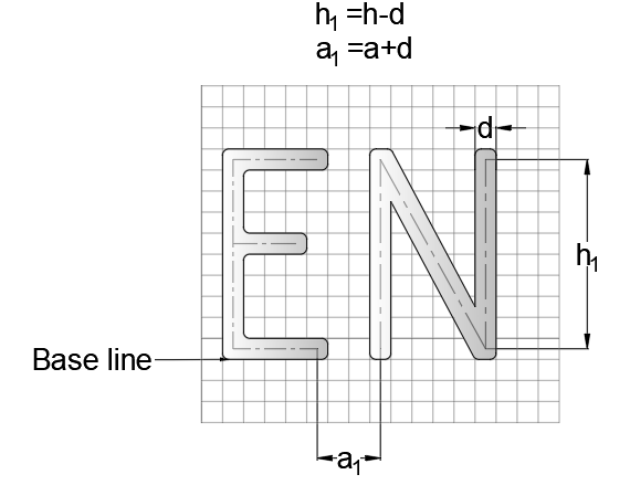
The center line of a letter is very important in lettering for maintaining uniformity. The nominal size (h) and the spacing between characters (a) shall be considered as the basis of deciding the central line.
The line width for the lower case and upper-case letters for particular lettering will be the same.
The height of the letters
The letters are designated by their height in engineering lettering. The height of the capital letters designates the height of the letters. The height of the lowercase letters is 5/7 of the height of the upper case letters.
The stem of lowercase letters, such as, b, d, h, etc., which extend upwards, are called ascender, have the same height as the upper case letters.
The stem of lowercase letters, such as, g, j, p, q, y, etc., which extend downwards, are called descenders.
The ratio of height to width varies but for most of the capital letters, the ratio is adopted as 7:5.
The generally adopted height of letters are as follows:
- Drawing title- 6, 8 mm.
- Drawing Sub-title- 3, 4, 5, or 6 mm.
- Drawing numbers in title block-8, 10, or 12 mm.
- Dimensions, legends, schedules – 3, 4, or 5mm.
- Letter for denoting drawing lines – 8, 10, or 12 mm.
Lettering angle
There are two types of lettering with respect to lettering angles.
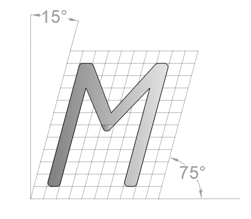
- Vertical lettering: in this type of lettering the letters are inclined at an angle of 90° to the horizontal.
- Inclined lettering: in this type of lettering the letters are inclined at an angle of 75° to the horizontal or inclined to the right at an angle of 15° from the vertical.
Types of lettering in Engineering drawing
The letters are broadly classified into two categories – (a) Single-stroke letters and (b) Double-stroke letters.
Single stroke letters
The Indian standard recommends the use of single stroke lettering in engineering drawing. This form of lettering in engineering drawings is the simplest and most employed.
The word single-stroke does not mean that the lettering has to be done in a single stroke without lifting the pencil. It actually means that the thickness of the line of the letter has to be such as it is obtained in a single or one stroke of a pencil.
The vertical or inclined lines of letters should be drawn from top to bottom and horizontal lines from left to right.
Indian standards further classify the lettering in engineering drawing into four categories as:
- Lettering ‘A’ -(use pencil and ink drawing)
- Lettering ‘B’ -(use pencil and ink drawing)
- Lettering ‘CA’ -(use the applications like CAD for numerically controlled drafting)
- Lettering ‘CB’ -(use the applications like CAD for numerically controlled drafting)
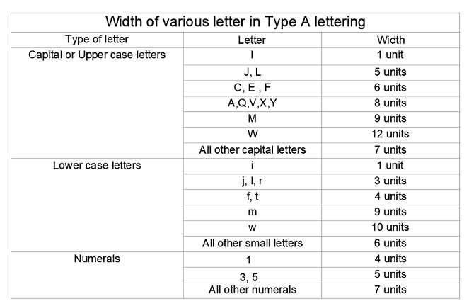
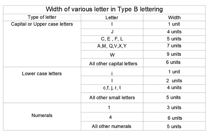
In lettering ‘A’ type the height of the upper case letter is divided into 14 parts, while in lettering ‘B’ type the height of the letter is divided into 10 parts.
Width of Lettering Type ‘A’
Width of Lettering Type ‘B’
General rules for Lettering in Engineering drawing
The following are the rule which is to be maintained while lettering –
- The line thickness of the letter should appear in such a way as it is obtained in one stroke of the pencil with uniform pressure, but not so much that it cut grooves in the drawing sheet.
- Words should be placed one letter apart.
- The letters should be spaced in such a way that the area between letters is almost equal.
- Letters and numerals should not touch each other and should not touch the lines.
- In lettering, the horizontal lines should be drawn from left to right and inclined or vertical lines are drawn from top to bottom.
- After a few words are made, the pencil point will become dull. To maintain the uniform lettering the pencil point should be maintained well sharpened.
- While lettering, the pencil should be continuously rotated in the finger.
Pencils for Lettering in Engineering drawing
For marking guide-lines a 3H or 4H is best to use. The actual lettering should be done with a well-sharpened H pencil with a conical point.
Techniques for Achieving Clear and Precise Lettering
- Consistent Font Size
- Maintain a uniform font size to ensure readability and a professional look.
- Use of Guidelines
- Use horizontal and vertical guidelines to keep letters aligned and evenly spaced.
- Legibility Over Creativity
- Focus on clarity with straightforward lettering styles instead of decorative designs.
- Contrast Enhancement
- Ensure visibility by using dark letters on light backgrounds or vice versa.
- Whitespace Management
- Leave ample spacing around text to prevent clutter and enhance clarity.
- Digital Tools for Precision
- Leverage CAD software for precise fonts, sizes, and alignment options.
- Hierarchy of Information
- Use varying font sizes or styles to differentiate titles, dimensions, and notes.
- Color Coding
- Organize elements visually by using a color-coding system.
- Review and Revise
- Regularly check and refine lettering for accuracy and clarity before finalizing.
- Regular Practice
- Improve lettering skills through consistent practice to achieve precision and fluency.
What role does lettering play in conveying information accurately?
Lettering is the language of precision in engineering drawings. It plays a vital role beyond aesthetics, functioning as a crucial medium for delivering accurate information. Here’s why lettering is indispensable:
- Conveys Technical Details Clearly
- Engineering drawings rely on precise dimensions, annotations, and notes. Lettering ensures this information is legible and easy to interpret.
- Maintains Industry Standards
- Standardized lettering adheres to industry norms, ensuring consistency and uniformity across drawings, making them universally understandable.
- Prevents Miscommunication
- Clear lettering minimizes errors in design interpretation, helping avoid costly mistakes in manufacturing or construction.
- Enhances Professionalism
- Well-executed lettering reflects professionalism and attention to detail, crucial for stakeholder confidence.
- Supports Complex Designs
- With numerous components in engineering projects, lettering organizes and highlights essential details for seamless comprehension.
In essence, lettering transforms engineering drawings into a universally understood blueprint, enabling precision and flawless execution of designs.
How Is Lettering Standardized in Engineering Drawings?
Lettering must adhere to strict standards to ensure uniformity. Here are some of the common standards that most engineers follow:
- ISO 3098: This international standard specifies guidelines for lettering used in technical drawings.
- ANSI Y14.2: In the U.S., this standard provides guidelines on line thickness, size, and lettering style.
- DIN 6776: German standards for lettering in technical documentation.
The main objective of these standards is to ensure legibility, consistency, and clarity. Letters should always be vertical, and the space between them must be balanced for readability. Uppercase letters are generally used because they are more easily readable than lowercase letters.
Do’s and Don’ts in Lettering
Do’s
- Regular Practice
- Hone your skills with consistent practice to ensure precision and clarity.
- Review and Revise
- Always double-check your lettering for accuracy and make necessary revisions.
- Consistent Typeface
- Use a standard, readable typeface for a professional look across all projects.
- Hierarchy of Information
- Highlight key details using varied font sizes or styles to improve understanding.
- Contrast Enhancement with Color
- Use colors strategically to improve legibility and emphasize critical information.
Don’ts
- Overcrowding
- Avoid clutter by spacing out text and maintaining sufficient whitespace.
- Inconsistency
- Steer clear of mixing lettering styles or sizes in the same drawing.
- Unreadable Fonts
- Use fonts that are easily legible in both digital and print formats.
- Ignoring Digital Formats
- Ensure clear lettering in CAD and 3D models, as annotations are vital there too.
- Compromising Professionalism for Creativity
- Maintain a balance—personal touches should enhance, not detract, from professionalism.
FAQs on Lettering in Engineering Drawing
1. What is the standard size for lettering in engineering drawings?
The standard height for lettering is typically 3mm for general text and 5mm for titles. These sizes ensure legibility across technical documents.
2. Why is freehand lettering still important?
Freehand skills are useful for quick sketches and preliminary designs. While CAD tools dominate, manual lettering demonstrates foundational skills and is handy for on-the-spot corrections.
3. Can I use cursive writing in engineering drawings?
No, block letters are the standard for engineering drawings. They ensure clarity and are universally understood.
4. How can I improve my lettering skills?
Practice regularly using graph paper or ruled templates. Focus on maintaining consistent letter sizes and spacing.
5. Are there digital tools for lettering?
Yes, CAD software like AutoCAD and SolidWorks include built-in tools for precise and standardized lettering.
6. What are the best tools for manual lettering?
Essential tools include high-quality mechanical pencils, stencils, lettering templates, and durable erasers.
7. Why do engineering drawings need standardized lettering?
Standardized lettering ensures that everyone involved in a project interprets the drawing consistently, reducing miscommunication and errors.
8. Can improper lettering cause errors?
Yes, illegible or unclear text can lead to costly manufacturing or design errors, making proper lettering a critical aspect of engineering drawings.
9. What is the purpose of inclined lettering?
Inclined lettering, typically slanted at 15°, is sometimes used for aesthetic appeal but is less common than vertical lettering in technical drawings.
10. How does CAD improve lettering?
CAD tools automate lettering, ensuring precision, consistency, and adherence to industry standards. They also save time and allow for easy modifications.
Conclusion
Engineering drawing lettering isn’t merely ink on paper—it’s a language of precision, a conduit of ideas, and a testament to the meticulous craftsmanship of engineers. The art of lettering breathes life into designs, transforming lines and symbols into a symphony of understanding. As technology advances, the heart of lettering remains unchanged: the unwavering commitment to clarity, accuracy, and innovation.
Key Takeaways
- Importance: Lettering ensures clear communication and professionalism in engineering drawings.
- Standards: Follow ISO or ANSI norms for consistency.
- Tools: Invest in quality tools like pencils, stencils, and guides for better results.
- Practice: Regular practice is the key to mastering manual lettering.

